Design Insights August 14, 2026
By Zaina Rafique
A rebrand usually begins in a room most people never see.
There are decks, options, references, meetings, debates, approvals, legal checks, and probably one folder named “Final_Final_Actually_Final.” Then one day, the identity leaves that room and enters public life.
That is when the logo leaves the safe zone. The audience does not see the meetings, the strategy notes, or the long list of rejected options. They see one mark, place it next to what they already know, and form an opinion quickly. Sometimes that opinion is kind. Sometimes, impulsive.
That is where the Godrej Industries Group rebrand found itself.
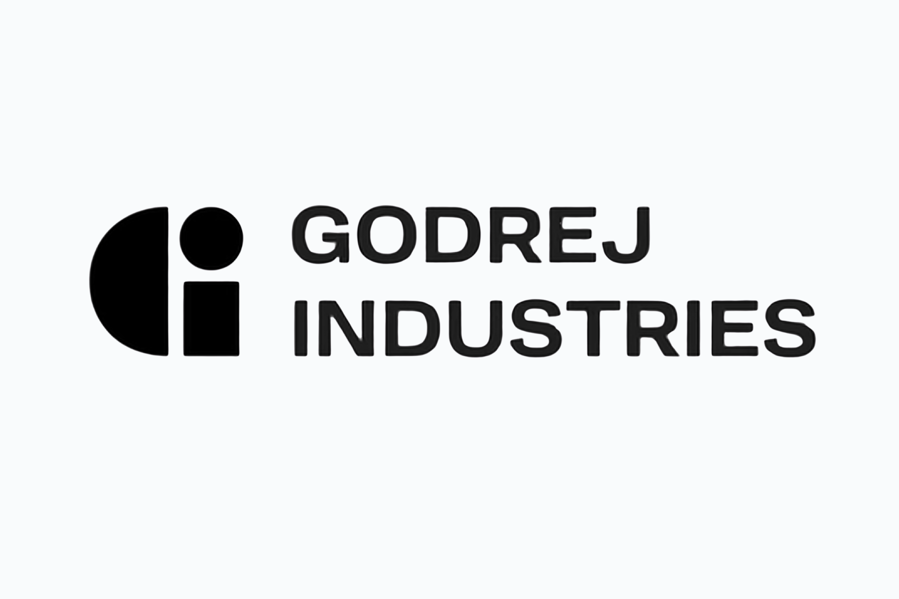
On April 22, 2026, Godrej Industries Group announced a new purpose and identity with the line “Crafting tomorrow since 1897.” The refresh also came with a larger business ambition: reaching ₹5,00,000 crore in combined market capitalization by 2031. The identity was built for a group with a 129-year legacy and a new structure after the 2024 Godrej family business split.
So, the identity had a serious job. It had to carry history, signal a new phase, and give the group a clearer corporate voice. Instead, it ended up sparking debate among the netizens.
The logo entered the public chat
Soon after the reveal, the new GI identifier drew comparisons with the logo of Guerrilla, an Australian creative agency. Godrej Industries Group responded that the GI mark was original, distinct, legally sound, and developed after multiple options and IP checks. The group also clarified that the GI identifier is a corporate group mark, meant to appear with the Godrej signature logo or company name.
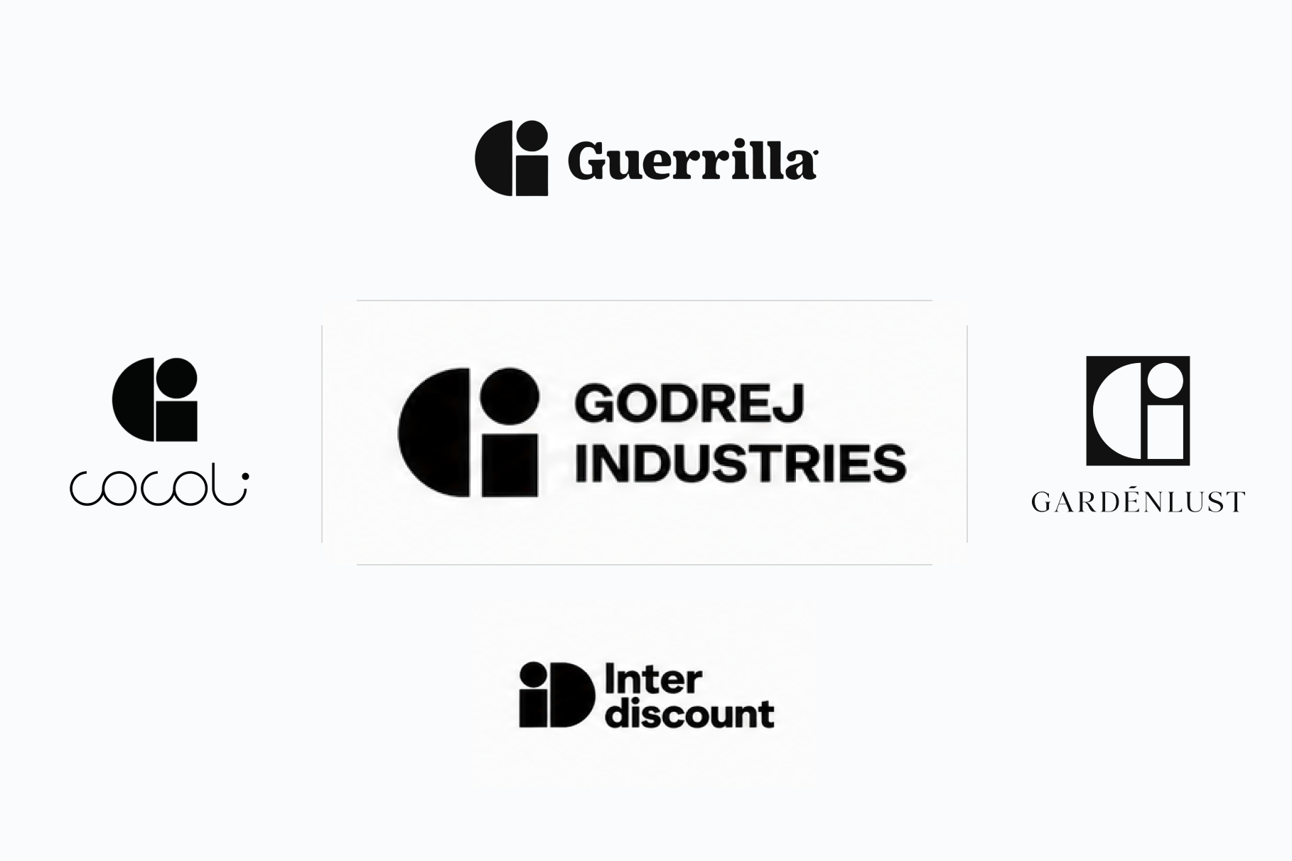
The conversation did not stay with one comparison. Across social media, people also placed the mark beside identities such as Interdiscount, COCOLI, Gardenlust, and others. The concern here is pretty straightforward: how far can a brand reduce its identity before people start seeing plagiarism or compare with existing ones?
Simple marks carry sharper pressure
Simplicity works well in modern branding for obvious reasons.
A simple identity is perceived easily across regions, people, screens, investor decks, social media, reports, and internal systems. For a large group like Godrej, that flexibility and accessibility matters.
Godrej Industries Group’s refresh was presented as a wider brand system, with a new visual language, custom typography, sonic identity, and a signature fragrance across touchpoints.
However, pressure comes from the same place as appeal.
When a mark becomes highly generic, it enters a crowded visual field. Circles, cuts, rectangles, and letter-based forms are used by many brands across the world. A mark can be carefully developed and still feel visually close to something the audience has seen before. It’s a classic modern branding challenge. Legal comfort does not always create public comfort. Once people feel an identity already exists, the brand has to spend energy explaining the identity before the identity can do its own work.
Legacy makes every change feel personal
For many Indians, Godrej lives inside homes through cupboards, locks, appliances, soaps, hair colour, real estate, and daily household memory. People may not follow every corporate shift, but they know the name. They carry trust and emotion around it.
That automatically makes any Godrej rebrand sensitive.

A heritage brand carries memory before a new message. People compare new expressions with what they are already used to. They ask whether the brand still feels like it. They notice what has changed, and they notice what feels distant. The “Ab woh waali baat nahi rahi” feeling.
A rebrand has to make the next chapter visible while keeping the old trust alive. To balance that is very difficult and takes years to achieve, and it deserves more than instant praise or instant rejection.
The internet meets the mark before the manual
Brand teams think in systems. They think about logo use, typography, motion, tone, colour, applications, and internal rules. The public usually meets the identity through one image.
That image gets cropped, compared, posted, questioned, and judged. In that moment, the logo becomes the shortcut for the entire rebrand.
Godrej Industries Group has clarified that the GI identifier is meant to appear with the Godrej signature logo or company name, and that the consumer-facing Godrej signature remains unchanged.
Still, public perception rarely arrives in the same order. A logo has to survive screenshots, side-by-side comparisons, comment sections, thumbnails, and fast reactions.
That is why modern rebrands need to be tested outside the ideal presentation format. A logo should work inside the system, and it should still feel owned when people meet it with very little context.
The real question is ownership
The Godrej logo debate calls for retrospection.
When a brand chooses simplicity, what is it protecting? Is it protecting clarity? Is it protecting memory? Is it creating a mark that can travel across platforms while still feeling unmistakably its own?
These questions matter because rebranding is a trust exercise.
At SandCup, we see the concern as larger than one logo. It is about the responsibility that comes with identity creation.
Simplicity can make a brand sharper, lighter, and easier to use. It can also make a brand dilute its differentiation when the idea has been made too generic.
The strongest rebrands remove noise without removing ownership. They make the next chapter visible without weakening the memory people already hold.
We leave you with a simple question: When a logo leaves the deck and stands alone in public, does it still look unmistakably yours?
Explore Brand Positioning at SandCup
Be a part of our world and gain more insights on design and innovation!